Product and Design
An insider look into how we craft product and design at the leading edge of the Fintech industry. We'll share how we built it and what we learned along the way.

Sort by:
-
![]()
New logo, same us
New logo, same us Nov 15, 2021 5:15:18 PM Notice something different? We’ve updated our logo and overall look to reflect the brighter future we work with our clients to create. Hi! Yes, it's us! The automated wealth management platform you and 700,000+ customers know and delight in. See that new logo? It's brighter, sunnier, and, dare we say, more optimistic, than our previous logo. That's because we're a lot more than an investing platform. We're here to help you plan, save, and invest for your future—to help you achieve your literal dreams. We’ve been thinking about that a lot recently—about being more than an investing platform. So we did what any good and proper tech company would do: We partnered with our friends at Trollbäck+Company to review our brand strategy, tone, and visual identity. We began by broadening our mission: Making people’s lives better. It’s big. And we’re excited about it. Betterment is always working to make progress, putting the lives of the people we support at the center of what we do, all with the aim of getting better every day. To reflect this expanded vision of what Betterment offers, we refreshed our logo, which we’ve affectionately dubbed “the sunrise”, and created a new visual style. You’ll notice warmer colors, a more optimistic tone, and a focus on the future—and what we can make of it together. We won’t go into every angle of the design updates here (although, design nerds, keep your eyes peeled for an in-depth blog post coming soon), but we wanted to let you know that you’ll be seeing these changes across our website, app, social media, and more. Most importantly, you can rest easy knowing that our technology is still working as hard as ever to help you grow your money. A bit more on our design evolution When Betterment launched in 2010, we were the first of our category, a platform that made investing easier and more accessible for the masses. Our logo back then represented an element of our user experience at the time: a simple speedometer that showed a customer’s stock-and-bond allocation. Several years ago, we created a more modern, abstract speedometer. But, as our company has continued to grow—from an investing platform to a lifelong financial partner—the speedometer started to feel too focused on a single element of our investing product. It was about the numbers, whereas we had begun to focus on our customers’ lives as a whole. With our new mission established, we moved on to our logo, transforming the original shape into a path leading to a rising sun. This represents our broader focus on supporting not just your investing experience, but your journey to full financial security. Our color palette is now warmer and our illustrations are more serene, because we’re here to support you in making calm, deliberate financial decisions that can help your money grow over your lifetime. We’re especially excited about this home screen update and our ability to bring you a bit of positivity in every interaction: When you open your app today, it should feel like the investing app you signed up for—and a whole lot more. In summary: We updated our mission, logo, and visual style. We hope you like it. Love, Betterment -
![]()
Case Study: Preferred name
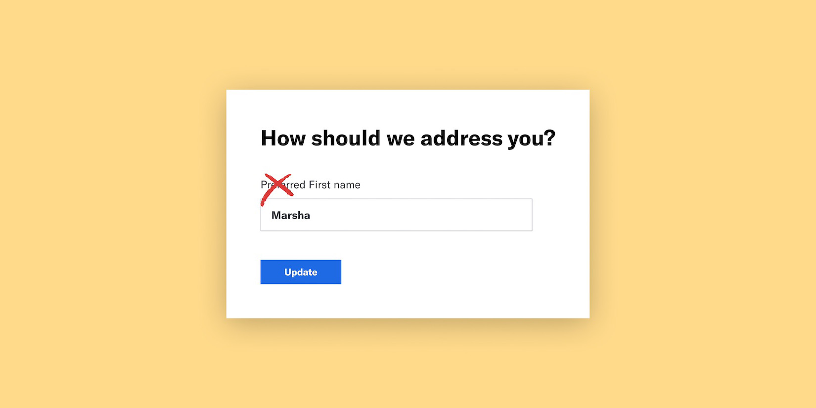
Case Study: Preferred name May 27, 2021 12:00:00 AM Part II in a series that explores inclusive design at Betterment. This post focuses on a case study on non-binary and transgender considerations in Fintech. In the financial world, asking a customer for their legal name in order to sign up or continue with a service is about as standard and default as it comes. But what about people whose legal name doesn’t fit with who they are? To take it a step further, what about folks who experience a form of trauma when they hear their legal names? For transgender and non-binary folk, there is nothing standard or default about the name given to them at birth. To address this, we’ve created space for a Preferred name, an off-the-side-of-our-desks project that gives customers the ability to input another name besides their legal name. The problem How can we navigate the legal complexities of finance, and create an experience that stops deadnaming our trans and non-binary customers? For this project, I worked with engineer Jesse Harrelson. Jesse and I decided the best place to start this project was to give customers the ability to enter their name in-app from the settings page. We knew the long-term goal was to capture this information during the sign-up process, but navigating the stakeholder complexities for such a contested funnel was too big a chunk to bite off for a proof of concept. Our solution For our proof of concept, we added UI to the settings page that would allow people to set their preferred name. Fairly straightforward, we knew we needed a button to launch a flow that would capture the customer's preferred name. We’d save that name, provide some education around when and why we had to use their legal name, and begin addressing them correctly in the app as well as in emails. Customer feedback showed us that we had made the wrong choice in using the word 'preferred' to describe the name by which a user would like to be addressed. That approach normalized the concept of a legal name and minimized the significance of the names users would enter into this feature. So we updated the copy to refer not to the user's 'preferred' name, but simply to their name. We chose a tone in our copy that was conversational and human, but maintained the respect and authority a finance app needs. The last problem to solve in the release of this feature was to decide how to display the legal name. We put our trans and non-binary customers first by choosing UI that gave the user an option of viewing their legal name—or not. A toggle was a natural choice to empower the customer. Learnings A trans or non-binary person’s name isn’t preferred; it’s their name. Period. This project is a quintessential example of what Project Inkblot calls “Targeted Universalism.” Jesse wrote a great blog post expanding on this, but essentially it is the idea that if you design your solution around your most adversely impacted persona, all of your users will reap the benefits. Think #blacklivesmatter. The sentiment behind this is also foundational in Microsoft’s Inclusive Design fundamentals. “Solve for one, extend to many. ” — Kat Holmes We were able to apply this principle directly by prioritizing the needs of our trans and non-binary customers. This mission helped us overcome fears that we would confuse cisgendered customers or that our legal team would oppose the feature (in fact, they were quite supportive). This core tenet expressed itself in our copy choices, product development process, and interface element choices. With the internal and external launches, we were delightfully surprised with how excited all of our customers were. The success of the project propelled the addition of preferred name into our signup flow, making Betterment’s product a little more inclusive. “By using design to make our customers feel seen, we create deep emotional engagement. When people feel a sense of belonging, they’ll give you repeat business and they’ll tell others.” — Aaron Walter, Designing for Emotion -
![]()
A Celebration of Culture Through Design
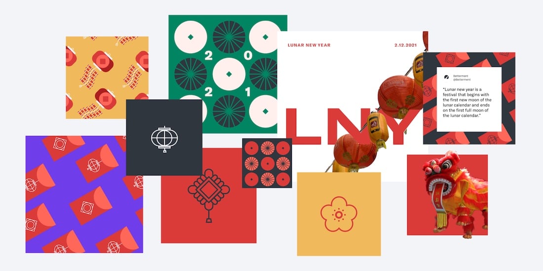
A Celebration of Culture Through Design Mar 30, 2021 12:00:00 AM How Asians of Betterment highlighted Lunar New Year through stories from our community. Hear more from Mai Nguyen, Cat Gonzalez, and Pam Do from Asians of Betterment and their collaboration with the Brand Team. Mai Nguyen and Cat Gonzalez, AoB Leadership Asians of Betterment (AoB) is an Employee Resource Strategy Group (ERSG) that was founded in early 2020 to serve the many Asian employees at Betterment. We saw an opportunity to build community over our shared backgrounds and experiences, especially as we transitioned to remote work. At the start of 2021, we wanted to highlight Lunar New Year, a huge event celebrated by many parts of the Asian community. A great way for us to celebrate Lunar New Year would be through sharing our family traditions and childhood memories. By spreading our stories both among ourselves and externally through an Instagram post, it helped our community feel seen and gave us an opportunity to share this joyous celebration with our colleagues. Hear more about how we landed on our final designs. Kim Pham, Brand Designer The idea of this post was to highlight stories within the AoB community and share how folks celebrated Lunar New Year as kids—most importantly, how we spent our red envelope money. The red envelope tradition is shared across many cultures and is generally gifted from the older to younger generation as a way to symbolize good luck and prosperity in the new year. The AoB team reached out to those within the group and received many responses, some that were recognized as traditional celebrations and some that were more unconventional. We thought it would be fun to illustrate some of the responses on the Instagram post. I took a look at Style Closet, Betterment’s design system, as a starting point for creating these illustrations. Our iconography style, which lives across our product and in marketing, has a simple utilitarian look that I used to inform early sketches. Even though I was directly translating Lunar New Year imagery and cultural motifs into our brand style, it still felt like the illustrations were missing what makes this holiday such a meaningful celebration. Lunar New Year celebrations have an inherent boldness, from the striking red color palette, to tons of firecrackers and strung-up decorations. I remember weaving through the streets of NYC Chinatown during Lunar New Year, leaving behind a trail of confetti and bumping into people of all backgrounds who were excited to share in our culture. I wanted to find a way to bring that joy and excitement into the visual, so I tried combining photography from Lunar New Year events. Although this helped capture more vibrant memories and emotions, we wanted to bring the designs closer to our brand style, and found a happy medium with these playful patterns. Lanterns, firecrackers, paper decorations, and Chinese coins were the inspiration for these illustrations. The added color and detail, typical of any red envelope design, helped give these visuals life and motion. We wove elements of these illustrations into the social post and shared a version of them as Zoom backgrounds for the company. Pam Do, AoB Leadership The power of design not only lies in capturing attention, but also in embracing identity, educating others, and creating bonds of allyship. In Kim’s Lunar New Year designs, the interplay of Asian tradition and Betterment’s design tenants highlighted the bold and joyous characteristics of Asian culture and identity, which invite communities of all cultures to join in celebration. We partnered with the Brand Team to post the Lunar New Year designs on Betterment’s Instagram page. Our Instagram was also used to celebrate Black History Month with fellow ERSG, Black at Betterment. Both Asians of Betterment and Black at Betterment were able to celebrate and advocate for our group’s history, struggles, resilience, and hope for a better future. Asians of Betterment is taking hold of the momentum from Lunar New Year and finding ways to bring our diverse identities together in celebration. Currently in the works: Asian Pacific American Heritage Month, coming to our social media this May. -
![]()
Trans Inclusive Design: Gender UI
Trans Inclusive Design: Gender UI Feb 5, 2021 12:00:00 AM Part I in a series that explores inclusive design at Betterment. This post focuses on making the case to remove the ‘gender question’ as well as some takeaways for building inclusive products. At Betterment, we’re embarking on a journey to discover what designing products that are truly for everyone might look like. We’re learning lessons: some we knew, some we didn’t. We learned how complicated asking a customer’s name can be. How to display data in a way for folks with different visual abilities, and what questions we should be asking in our product development processes. My name is Crys, I’m a product design manager on Betterment for Advisors. I’m also a non-binary person with a penchant for the radical and unconventional. Here’s a walk through of one of my first ‘inclusive design’ successes and my learnings along the way. TL;DR - Gender: Never, ever, ever, a radio button. It will create friction in your flows and it's exclusionary. But if you’re interested in getting into the weeds with me of how fraught asking this question is, read on! First, a thought experiment. When you put this in your experience, what are you really asking? The answer is probably more complicated than you think. Gender is not binary, nor is it limited to male and female. Male and Female are social constructions of masculinity and femininity and can vary across cultures. So when you ask whether or not your customer is male or female, are you asking about whether or not they are masculine or feminine? Is there an implied meaning for how that individual performs that role and is that important to your organization? What might that look like if our radios had that context? That’s maybe not what you are looking for in your original question. You probably are thinking in terms of their biological sex. Male and female makes sense in that context right? Nope. Sex is not binary nor is it limited to male and female. Biological sex has to do with genetics and chromosomes. I won’t get into the specifics, as I am not a geneticist, but sex can vary from what we typically think of as XX and XY, into other options such as X (Turner’s syndrome), XXY (Klinefelter), XYY, and XXXY. There are even more chromosomal variations beyond these six. So should our question look something more like: This would definitely create friction in our flows. Ok, so hyperbole and facetiousness aside, how do we move forward? How do we begin to challenge what’s likely common practice for most businesses? Ask questions. Ask yourself, your stakeholders, their stakeholders, and a few more people why you need to ask a customer their gender. Eventually, you will find the answer. Once you know the answer, you can solve the problem. Early in my career, I was told to ask a ton of questions as part of my design process. My last design mentor told me to ask five questions in response to a point or feature. Up to this point, I’d tried that out, but found it really uncomfortable. I didn’t want to seem like a trouble maker or hard to get along with. And also, they were way more knowledgeable than me, so I’d better trust them. Right? At Betterment, we asked that frought gender question to anyone signing up for an account. I work on the Betterment for Advisors business line, the platform that gives financial advisors the ability to manage their clients’ money using Betterment. Here, we allow advisors to set up accounts for their clients, to streamline the sign up process for their clients. Our intent here was to reduce friction for our clients, but the actual impact meant that our advisors were put in the awkward position of identifying someone’s gender—possibly misgendering them. So I started asking around about why we ask this question. I asked product folk, other designers, engineers, my General Manager and my VP. I became what felt like a squeaky wheel, because I was passionate about it. I’m a nonbinary person myself and had seen the feedback from our trans and nonbinary customers who couldn’t advance past this part of the flow. This question created so much friction for them, they dropped out and went to another business. After digging, we did have a reason for wanting to know this information. Our human advice team has intentions of using demographic data to personalize the algorithms that give financial advice, but we weren’t there yet. This meant we were alienating potential customers without even having a business benefit for it. Ultimately, we removed the gender question and tabled it until we knew what exactly we wanted to do with it. Seeing the PR that removed that 11 lines of code might have been the highlight of my career as a product designer. But what if you really really need to ask a customer’s gender or sex? This question has already been answered several times over. My favorite response is from the “UX Collective” blog. This small feature was my first exploration into inclusive design. It has been an Aha! moment for me, unifying my passions for craft and social justice. I’ve learned from this, and subsequent projects that there are repeatable moments or questions you can ask yourself as a designer in order to build inclusive products. I’ve read a lot about inclusive design, but it's only in retrospect where I can see those principles put into place. Here’s how you can be more intentional about inclusive design from the start: Think critically. Regardless of the intent, what’s the actual impact and on whom? To take it a step further, what’s the worst case scenario? (Credit: Project Inkblot) Ask questions. I belaboured this point above, but asking questions is the sign of a healthy culture and be skeptical of quick or vague answers. Get specific. Making your questions specific will help with the first two suggestions. It will also move you toward articulating the problem with clarity and persuasiveness. Humans have a tendency to take mental shortcuts. It's been an enormous survival strategy but it can very often lead to bias. Slow down. As a startup, we move quickly to bring value and viability to the business. Take a pause, make some space for questions, and be open to what you may uncover. Solve for one, extend to many. (Credit: Microsoft Inclusive Design) By considering the experience of your most adversely impacted customer, all of your users will reap the benefits. By taking out gender radios to allow non-binary folks to sign up for our product, we reduced friction for the rest of our customers. These are just a few things that I’ve started to incorporate into my design practice. I hope that you find them helpful or a place for you to start thinking about your own work through this lens. If you are on this journey with us, keep trudging friends! We’d love to hear from you. If you are new in inclusive and equitable design, then a warm welcome and a word of encouragement: Be kind to yourself and others. Do your best and start somewhere. Just make sure you start! -
![]()
Socially Responsible Investing: From Idea to Creative Concept
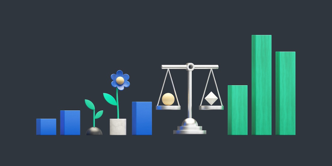
Socially Responsible Investing: From Idea to Creative Concept Jan 21, 2021 12:00:00 AM New Socially Responsible Investing Portfolios? New creative concept. One writer and one designer got to work, and this is what they came up with. Earlier this year, our Investing Team let us know that three new Socially Responsible Investing Portfolios were on their way. These portfolios give our customers the opportunity to invest their money in funds that align more closely with their everyday values, and are selected based on ESG (Environmental, Social, and Governance) criteria. Our Broad Impact Portfolio includes more ETFs (exchange-traded funds) that meet ESG standards; our Social Impact Portfolio includes two new funds that support minority empowerment and gender diversity; and our Climate Impact Portfolio supports companies with lower carbon emissions and the funding of green projects by investing in climate conscious ETFs. Investing? Responsibly? Without giving up performance goals? I’m merely a copywriter, but I thought that sounded like a pretty cool opportunity for our customers—and it’s special when your work can support something that’s meaningful to you personally. The Creative Team (that includes me and our talented designer and animator Matt) got to work imagining how we could share these new offerings. With an upgraded Broad Impact Portfolio and two new portfolios (Climate Impact and Social Impact) available, we wanted to come up with a concept that represented our customers’ investing options. We started by brainstorming a key visual that could be used throughout all of the campaign’s assets, including paid social ads, organic social posts, emails to customers, in-app touchpoints, and even a Slack emoji for employees to have fun with. The bar graph monstera leaf visual we’d been using was a great place to start—it represented investment returns while conveying an element of sustainability. Working in the construct of a storyboard, Matt began with some simple 2D sketches while I played with headlines to pair with it. In addition to the flower to represent our Climate Impact Portfolio, we played with using a scale—commonly associated with justice—to convey our Social Impact Portfolio. We landed on “invest for better” as our hook for the campaign, using it throughout our assets. (And, yes, I do get a kick out of using the word “better” in Betterment’s copy.) We continued to iterate, incorporating a product shot to tell the full story, which is, simply: Now, you can invest in what you care about using Betterment. Then, Matt got to work creating the scene in our 3D style. (I love seeing how Matt brings our Zoom ramblings to life—how he creates in 3D will need to be its own blog post or three.) We had a little fun with these neon elements and, even though we thought the scene looked super cool with them, we decided it wasn’t adding to the story in a way that warranted their use. Thus, we landed on this visual, which tells the story of investing in sustainability and social justice while maintaining your performance goals. Finally, Matt used his magic (and a little bit of Cinema 4D) to animate the scene, and you can see the result in this paid ad. If you received our emails, saw our social media posts, or logged in to your Betterment account to update your own portfolio, you likely saw this image in some form. We’re really proud of where we landed—especially because we’re so proud of our Socially Responsible Investing Portfolio options. -
![]()
Behind the Scenes of Our Holiday Creative
Behind the Scenes of Our Holiday Creative Dec 23, 2020 12:00:00 AM How the Brand Creative Team set out to imagine togetherness and connection with our Betterment family Like most of 2020, our holidays might look a bit different. We spent much of this year finding creative ways to spend time with our loved ones and colleagues. This surfaced the idea of togetherness, despite us physically being apart. So, as creatives are wont to do, we thought about how we could bring this idea to life. Get a behind-the-scenes look into the design process of our new holiday illustration with Brand Designers Kim Pham and Matt Calabrese. 1. Start with a sketch Kim Pham: I began by illustrating rough concepts that Matt, our 3D modeler extraordinaire, would implement using Betterment’s visual style. For these illustrations, all I needed was my iPad, Apple Pencil, and Procreate app. A couple of add-ons that help me with drawing is this Artisul stand and this paper-like screen protector. Working in Procreate allows for endless iterations—a value we’re into here at Betterment—and includes an animation feature that can help with storyboarding ideas. I couldn't help but start with throwing a string of lights around our speedometer because, well, what’s more festive? Matt and I then talked about creating a sense of place and connecting that to the theme of togetherness. Since we have three office locations (Denver, Philly, and NYC) I thought it would be fun to illustrate a landmark of each within a snowglobe. But we realized there was something fundamentally missing from this scene: our customers. We wanted to create something that would represent the whole Betterment family. I started to think about the concept of home, and how we’ve all experienced home in a new way this past year, whether because we moved, were displaced, or we simply spent more time indoors. We agreed that a home, whatever that may look like to different people, represents more to us than in years past. Creating a little window into different worlds allowed us to feel a bit more connected. From there, we thought of ways we could simplify the visual and ended up merging a couple of the ideas. We used the snow globe as a foundation because, hello, festive, and the idea of a bubble resonates this year. To top it off we used one of our existing goal illustrations to really set this cozy winter scene. On the Brand Creative Team, there's no shortage of sharing. We love to share ideas early and often and to ask for feedback in our twice-weekly Creative Studio meetings for some face-to-face time. We also make great use of our team Slack channel to get thoughts on ideas. And that's where we got this gem from Senior Designer Michele: Our Floridian colleagues confirmed: Lightly falling snow can make even our warm-weather friends feel holiday delight. 2. Time to 3D Matt Calabrese: Thanks to Kim’s lovely sketches, I had a pretty clear vision for how this snow globe idea could come to life in 3D. I fired up Cinema 4D and got straight to work. What’s nice about the snow globe visual is that it’s composed of basic primitive forms, so it fits nicely within our design language for 3D illustrations. The snow globe itself is simply a cone, a cylinder, and a sphere stacked on top of each other. Then I removed the bottom part of the sphere to make it flat, and gave it some thickness since it would become the glass part of our snow globe. Then it was time to fill in the snow globe with our little winter scene. I had already created a 3D house, so I placed it in the center and started to build some more elements around it. Kim had some trees and a snowman in her sketch, so I felt it was important to add those in to create a sense of environment. And, of course, we can’t forget those twinkling lights! 3. Bring it to life Matt Calabrese: Once I finished composing the scene, it was time to bring our snowglobe to life. Of course our primary animation was going to be the snowflakes falling, so I didn’t want too much additional animation in the scene itself. Some smoke puffing out from the chimney and some light flickering in the window was enough to imply that not only is this little house occupied, but its inhabitants are nice and toasty. To animate the snowflakes, I used a dynamic simulation in Cinema 4D. Basically, the software does its best to simulate gravity, and to reflect how objects would bounce off of each other in the physical world. This kind of calculation can be pretty demanding on my computer’s processor. Luckily, all I had to do was place the snowflakes on the ground and give the snow globe a good shake—just like in real life! Last but not least, it was time to light, texture, and render our animation. This is probably my favorite part of the process because it really determines the look and feel of the final product. I lit the scene using a very basic studio light setup. Then, I applied our different brand materials to each of the objects to give them some color and texture. After trying out a few different looks, I was ready to smash that “render” button, and composite the animation for final delivery. Here’s a final look at the holiday animation—ain't it cozy? You can find it on our social media. Wishing you and yours joy, peace, and a renewed sense of togetherness this season. -
![]()
Test Big or Go Home
Test Big or Go Home Dec 7, 2020 12:00:00 AM Running lots of small split-tests made my team feel productive and gave us plenty to talk about. But it failed to answer the questions that mattered most. On a bright winter afternoon last year, I looked out the conference room window. Clean, blue sky stretched over the wall of mid rise buildings across Manhattan’s 23rd Street. I listened passively as the hair-splitting arguments set in. “Well…I’m not sure we can come to a conclusion on this test—it’s only been running for 12 days.” “Well, I’m not sure it’s the placement of the button that was bad—it might just be the copy we used in this version of it.” “Well, I’m not sure this new page design is what worked—it might just be the image we used in this version of it.” I was the product manager on the growth team responsible for getting visitors to Betterment’s website to sign up and deposit money with us. We’d host a meeting every Friday afternoon to review split-tests in progress in the hope of calling them—that is, to determine whether recent changes we’d made to the website or signup flows were driving more users to open accounts and make deposits. Fancying ourselves data-driven, we sought to guard against flawed observations that might lead us to a wrong conclusion. Our approach was rigorous but exhausting. As I zoned out and looked at the sky, I thought about something Katherine Kornas, a product leader who had joined the company a few months earlier—and to whom I reported at the time—shared at a recent product team meeting. “It’s not a failure when your split test loses,” she’d said, “it’s a failure when your split-test is inconclusive.” When you change your product in the hope of spurring signups and it actually drives signups down, she shared, you’ve at least learned what doesn’t work. When you change your product and nothing happens, you’ve learned almost nothing about users’ needs or behaviors. At that moment, learning about what users wanted was more important than ever. We were still figuring out how best to draw site visitors into a new type of product. Smart Saver was an account that was filled with money market and government bond funds and designed to earn a modest but reliable return. Having spent years making our name as the place to invest for the long-term, Betterment had developed a product built for the kind of short-term dollars that one might otherwise store in a savings account. Smart Saver was the precursor to the cash management products we’d go on to launch in the ensuing year: Cash Reserve and Checking. My team and I wondered how to feature Smart Saver in our signup flows and on our website. Should it sit front-and-center on the homepage? That would be great for those who arrived in search of that product, but it might confuse visitors who arrived in the hope of rolling over a 401(k). How could we talk about this particular product without obscuring the larger story of what Betterment was all about? No one knew for sure, but Katherine had the expertise to guide us toward the answer. “We need to think beyond the page,” she told me in one of our weekly one-on-one meetings. Katherine could sense that the split-testing approach I’d managed—with its small tests that changed only a single thing at a time—would never crack the bigger questions around how best to sell our burgeoning cash products. She urged me to think bigger, about entire flows, or even the broader swath of the user experience. That was tough to hear. I was proud of running dozens of tests and reviewing them ruthlessly. It made me feel like the data-driven product manager I thought I was supposed to be. Even if running numerous tests led to a lot of arguments in our tedious review meetings, it also gave me a lot to talk about—in release notes, at team meetings, and in reports to the broader growth team. As I re-read my notes from the time, though, I can see that for all my talking, I shared little in the way of strategy-shaping insights. Katherine was right to call for fewer, but better, tests. Instead of starting with an idea for a feature or design change, she said, I should start with a big question: what's the thing we’re trying to learn? What change to the user’s experience—ideally across multiple stages of their journey—would teach it to us? How might our strategy for the coming months change if the test wins? What about if it loses? The big test We went on to test a new, vastly different experience for users who arrived at our site with an interest in Smart Saver. We sent them down a signup flow that was unique for its silence on our investing accounts. We wanted to avoid mentioning any product other than the one the user came for. When a customer finished signing up and arrived at their dashboard, we affirmed to them that they had opened a Smart Saver account and invited them to fund it. This new approach earned strong results. Strong enough, in-fact, to beat back the kind of hair-splitting questions that had arisen in test review meetings of the past. It established a pattern that Betterment still uses today. If a site visitor seems intent on opening a certain kind of account—say, Cash Reserve, an IRA or a general investing account—we draw into a flow that focuses tightly on getting them settled in. We wait until later to tell them what else about Betterment they might enjoy. A test is likely big “enough” if it earns buy-in from stakeholders that X result should indicate Y change in your approach. Imagine you’ve replaced your homepage hero image with a picture of a dog. As the test gets underway, you tell your colleagues from marketing, design and engineering that if the dog picture drives signups, you’ll display only pictures of dogs throughout your public-facing pages, your signup flows and even in-app. It would be easy for anyone in the room to raise doubts. “Well, maybe dogs just work on the homepage, but not on other pages.” “Well, maybe it’s just because this dog is a Labrador, people might not like German shepherds.” “Well, maybe people just like four-legged animals. Can we try a cheetah?” You’ll stand a better chance of winning the room if you suggest a more comprehensive test: placing pictures of various dogs throughout the user journey—not just in one spot. You might propose that, if the test drives not only sign-ups but also deeper levels of engagement, it will show that dogs are key to acquisition and retention. The key is to strike an agreement with your stakeholders in advance about what result you’re looking for and, more importantly, how it would change your strategy for the months to come. In thinking bigger about split-tests, my team and I learned how best to draw users into our service. Personally, I learned something even more important. While one should certainly be afraid of drawing the wrong conclusion from a change to the user experience, one must also beware of making changes that are so small as to yield no conclusion at all. -
![]()
A Comprehensive Guide to Accessible Data Visualization
A Comprehensive Guide to Accessible Data Visualization Nov 2, 2020 12:00:00 AM When you design for accessibility, you benefit everyone. Your charts and graphs (and users) will thank you. For many organizations, accessibility is often overlooked. It’s rarely prioritized because it’s not perceived to benefit a majority of users. The work required to fix existing issues is too great. It’s simply a “nice-to-have.” I get it. In the tech world, we want to ship the most impactful stuff and we want to do it quickly. We swear by the 80/20 rule. But according to the Centers for Disease Control and Prevention (CDC), 1 in 4 adults in the U.S. live with a disability. That’s a huge population—61 million people, in fact. Yet if you focus on the flip side, the vast majority are still nondisabled. So how do we make the case for accessibility? It starts with your company’s values. At Betterment, we’re working to make both our company and our product more diverse, equitable, and inclusive. We’re no longer striving for the MVP, but the MLP (Minimum Lovable Product, except we’re taking it a step further and aiming for Maximum). This means no population should be excluded or feel unwelcome on our platform. Accessibility is an important part of that mission, and we’ve made a choice that everything we ship must be accessible. Does it require additional effort and forethought? Sometimes. But we’ve found that starting with accessibility as our baseline actually creates a better experience for everyone. Digital Accessibility Disability comes in many forms, like auditory, cognitive, neurological, physical, speech and vision.1 Thus, what it means to be accessible is an expansive question. It boils down to building products that all people can use, inclusive of those with disabilities or situational limitations. The World Wide Web Consortium (W3C) developed a set of accessibility benchmarks called the Web Content Accessibility Guidelines (WCAG) that is widely-accepted as the standard for building, well, accessibly. We can lean on this list of rules for all projects as it covers everything from information architecture to video. So what—and who—should we take into account when creating charts or graphs? Users With Visual Impairments While a wide range of disabilities are important to consider when building digital products, visual impairments or deficiencies are the most relevant when we consider data visualization. A major use case to consider is low vision or blindness. These users often rely on assistive technology, like a screen reader, to navigate websites or apps. Screen readers are software that scan the content of a page and output it into speech or braille, often operated using keyboard commands. The video below is a firsthand look at how they work. Another common use case is color blindness, or color vision deficiency. To support these users, design for clarity and follow proper color contrast guidelines (more on that below). There are four types of color blindness:2 Deuteranomaly/Deuteranopia: green appears to look red Protanomaly/Protanopia: red appears to look green and duller Tritanomaly/Tritanopia: blue and green look alike; yellow and red look alike Achromatopsia: unable to perceive color Other visual impairments to be aware of include tunnel vision (loss of peripheral vision) or light sensitivity (trouble with screen brightness or light-colored backgrounds). Learn more about visual impairments from the W3C. Once we understand the users that may interact with our chart or graph, we can begin to accommodate them. Let’s get to it! Start with a strong foundation. The following is true for any data visualization, but is especially important when you’re focused on accessibility. A concise and coherent concept ensures users of all abilities can engage with your visualization. Put the numbers aside for a moment and ask yourself these questions: What story does the data tell? This helps you decide which aspect(s) to focus on. Imagine a chart that shows the populations of 10 major cities. If your goal is to compare San Francisco and New York, let that story shine through. This means Chicago’s population isn’t as relevant, and you might choose to minimize it. Likewise, if you have a particularly complex data set, you can break it into smaller and simpler chunks. How should the reader benefit from the visualization? Consider how your graph will help the user understand insights from the data. Like in the previous example, layer in context to pull those learnings to the surface. Can you understand it in 5 seconds? If the visual adds more complexity than your written word would otherwise, think about whether you need it in the first place. Avoid “well, it technically passes…” When teams work towards accessibility, there are several benchmarks they can use to measure success—for instance, this method to mathematically determine whether the contrast of text color on its background is sufficient for users of varied visual abilities to comprehend. For color contrast, the answer is clear whether we pass or fail. However, not all aspects of accessibility can—or should—be measured this way. Our benchmark should instead be an equitable experience for users of all circumstances and abilities. It’s simple to follow a checklist of standards (the aforementioned WCAG, for example) and walk away feeling like you’ve successfully cleared the accessibility hurdle. We must go further and strive not for a passing experience, but a great one. Our benchmark should instead be an equitable experience for users of all circumstances and abilities. Let’s hear an example related to data visualization. One quick method to help your graph “pass” accessibility guidelines is to ignore how it looks or functions, but stuff behind it the table of data it references. The table is invisible on the page, but screen readers can still access it and thus, read out the rows and columns of information. You might think, “well, the table lets the user access all the information in the graph. That’s accessible.” While this approach technically does make the data accessible, it fails to provide a high quality experience for someone using assistive technology because it’s missing the story or insight that the graph illustrates. Check out this video from the University of Colorado for a deeper look at what it’s like to navigate a table using a screen reader. When we revisit the questions in the prior section, we learn that the table experience misses the mark. Anatomy Of An Accessible Graph The example below is a graph that’s accessible in its own right—it doesn’t rely on a table to communicate the data to those using assistive technologies. Let’s break down the design: Title: Give the visualization a descriptive “takeaway” title that illustrates the major insight. Fine: “My ice cream consumption compared to the national average” Great: “A graph titled: My yearly ice cream consumption has bested the national average since 2010. From the years 2000 to 2010, the yearly ice cream consumption levels of myself and the average American are similar. Around 2010, my consumption level spikes much higher and remains that way to the present day. The summary of the data is as follows…” Summary: In text, summarize in real, human words the story the information seeks to convey. This text can be discoverable only by assistive technology. If it’s also visible on screen without those tools, even better. Ask yourself: How would you describe the graph and its insights to a friend? Better yet, ask a friend to analyze it and summarize what they find. Axis labels (when applicable): Label each axis and their tick marks. This should be visible to the user and accessible through assistive technology. Data labels: Label each data point directly—use a connecting line, if you need to—rather than using a separate color-coded key. Users who cannot discern certain colors will still be able to interpret the data. Take the following into account during implementation: Alt text: Ensure your visual has descriptive alt text. Bad: “ice_cream_consumption_chart” Great: “Graph showing my yearly ice cream consumption is much larger than the national average” SVG format: If you can go the extra mile, build the graph using SVG rather than a basic HTML image. It provides a better experience to those using screen readers, as it allows access to the individual elements inside the graph. Read more about SVG graphs. Visual Best Practices Once all the right elements of your data visualization are in place, follow the guidelines below for its appearance. Here, we need to take into account both users with assistive technology and color vision deficiency. To support colorblind users: The following example images feature visual dos and don'ts. For the images in this section, I’ve duplicated them and applied a filter on the second version. The filter is meant to simulate how a person with colorblindness might perceive the original example. Follow color contrast guidelines. This might be a given, but it’s always worth repeating since it ensures legibility for all users. Here’s a deep dive into color contrast guidelines and how they work for more information. Below is the same example with a filter applied to simulate how a person with Protanopia would see it. The information in the “Don’t” version is even more difficult to make out. Label data points directly. It’s quicker to read, and ensures the graph can be understood without reliance on color. Below is the same example with a filter applied to simulate how a person with Tritanopia would see it. It’s nearly impossible to make sense of the color-relient key. Separate elements with whitespace or pattern. This means distinguishing between data isn’t entirely reliant on contrast between colors. Add whitespace between adjacent sections in a pie chart, or use different patterns in a line or bar graph. Below is the same example with a filter applied to simulate how a person with Deuteranopia would see it. Notice how the blue and purple sections nearly blend in the “Don’t” version. To support assistive technology: Avoid complex tooling. Stay away from sliders or other intricate tools when allowing users to manipulate the graph. Instead, try dropdown inputs—they can be used by screen readers. Avoid hover overlays. Don’t require a user to hover over a graph to see the data output. This is often difficult or impossible to do when using assistive technology. Instead, show the output at all times. Remain curious. It’s easy to write accessibility off as restricting creative license. In fact, these constraints are an incredible tool. When you design for accessibility, you’re not only assisting folks with disabilities, but embracing a vast range of life experiences. You serve the person recovering from a brain injury who has trouble concentrating. Or the parent juggling their newborn while managing their finances. Or someone at a sunny park, reading on their glare-filled phone screen. A clear and straightforward experience benefits everyone. The learnings above are by no means an exhaustive framework for accessible data visualization, but I hope they are helpful. The conversation about digital accessibility has come far, but it also has a long way to go. As designers, we can use our curiosity and empathy for users to drive it even further. Citations 1 World Wide Web Consortium (W3C), Introduction to Web Accessibility 2 National Eye Institute, Types of Color Blindness Any links provided to other websites are offered as a matter of convenience and are not intended to imply that Betterment or its authors endorse, sponsor, promote, and/or are affiliated with the owners of or participants in those sites, or endorses any information contained on those sites, unless expressly stated otherwise. -
![]()
Can You Be Creative In A Regulated Industry?
Can You Be Creative In A Regulated Industry? Sep 18, 2020 12:00:00 AM Regulated industries turn out plenty of bad and boring creative. But it doesn’t have to be that way. Here’s how we think about creativity. From finance to pharma, regulated industries catch more than a few (well-deserved) bad raps, including one close to my heart: bad creative. “It’s boring.” “It’s wordy.” “It all looks the same.” Blame for those sentiments often lands on those enforcing the regulations or the regulators themselves, like in-house Legal and Compliance Teams and governmental agencies. But it’s up to us—writers, designers, and our adjacent partners—to create and advocate for great work that meets everyone’s expectations. Can you be creative in a regulated industry? Of course! For me, the joy of working in fintech is in the challenge itself: fostering beautiful, badass, engaging creative ideas and executions in an unlikely place. Although regulated industries turn out their share of bad creative, there’s plenty of boring, wordy work that all looks the same in unregulated environments as well. That's why we have to reframe the problem. Compliance isn't the enemy, complacency is. Regulations aren’t arbitrary rules designed to transmogrify our otherworldly concepts into bland copy and design. They’re built to protect and inform consumers. Working within the guidelines of what is and isn’t legally and ethically compliant isn’t antithetical to great creative—it’s what sharpens our ideas. That isn’t to say that creativity in a regulated world is easy. Like anything worthwhile, it takes hard work and flexible thinking. The value of a great creative team (and great creative partners) is not in the raw conception of an idea, but in the building up, tearing down, twisting, turning, and wringing of the idea until it works and works well. Broaden and elevate your creative inspiration. Within a regulated industry, it can be easy to feel like you’re in an echo chamber of boring work. Change that. If everything looks and sounds the same, break away from your norms for inspiration: Find companies and people doing great creative work outside your industry and think through ways to translate that brilliance to your world. Consider work that comes from people who don’t look, sound, or think like you, from companies that aren’t even meant for you. Look beyond traditional advertising and brands. Restaurants create incredible feelings and experiences. Cities craft unique identities for themselves. Inspiration doesn’t have to come in the form of an ad. It’s easy enough to think that unlimited creative freedom equals better work. “If only I could do, make, say, think whatever I wanted...” But where’s the excitement in that, and what’s the challenge? If it were easy, it wouldn’t be great, and it wouldn’t be fun. After all, what makes us stronger? Pushing against resistance. The same goes for creative work. In fintech, the resistance is built in. The joy comes in meeting that resistance with our best ideas. -
![]()
Why Product Managers Must Resist “Quick Wins”
Why Product Managers Must Resist “Quick Wins” Aug 13, 2020 12:00:00 AM Tackling unplanned tasks from stakeholders made me feel helpful, but it bogged my team down. Here’s how I narrowed our focus to the most impactful tasks. “How hard would it be... …to add a section for notes?” …to make the button a little bigger?” …to add a banner to the homepage?” For a long time, I loved this question. My quick response of, “Oh, it shouldn’t be too hard!” felt like a cheap ticket out of a feeling I’ve often faced as a product manager: that I was failing to do enough for the teams that depend on me. I sat in a small, fluorescent-lit room during a one-on-one with a colleague, also named Joe, who was a leader in our company’s customer service team. Building tools for customer service was one of my team’s responsibilities, so I’d listen as Joe looked at his laptop and read from a long list of indignities his team faced–—disorganized screens, drop-down menus that lacked the one item they always seemed to need, and more. As I gazed down at the foot-long log that, for some reason, sat sideways between the two chairs in the small meeting room, a knot formed in my stomach. What kind of job was I doing if Joe’s team had to put up with so many menial, seemingly fixable problems? I snapped out of it when Joe asked a question: How hard would it be to redesign the instructions a customer sees when transferring a retirement account to Betterment? “Oh, that? Um, that should be pretty easy!” I said. It continued. At UX review sessions and in chat messages, stakeholders would ask how hard it would be to add just one more thing. I would smile and add the task to our backlog or to the upcoming milestone of a project. I was helping! At least, I thought I was. It’s not about difficulty. Meanwhile, projects were taking longer than we’d expect. I’d feel woozy looking down from the swaying height of our backlog. Small things had gained a stubborn habit of turning into one big thing. I realized my love of quick wins, of feeling helpful, was doing no one any favors. I’ve since changed my tune. When someone asks, “How hard would it be…” I respond with a question of my own. “How big would it be?” How much of an impact would it make? How much time would it save? How much revenue would it bring? What I’ve begun to share with stakeholders is that our backlog is home to dozens of tasks that we’ll never get to, simple as they might be. They linger there because they would fail to make a big difference in my team’s pursuit of our higher goals. It’s no use (anymore) to advocate for a bit of work solely on the basis of how easy it would be to complete. That cuts both ways. Our roadmap is full of projects that we expect will make a big impact: projects that will help not only our customers, but also those of our colleagues who serve them. These are projects we eagerly pursue—even though they are hard.

