A Comprehensive Guide to Accessible Data Visualization
When you design for accessibility, you benefit everyone. Your charts and graphs (and users) will thank you.


For many organizations, accessibility is often overlooked. It’s rarely prioritized because it’s not perceived to benefit a majority of users. The work required to fix existing issues is too great. It’s simply a “nice-to-have.”
I get it. In the tech world, we want to ship the most impactful stuff and we want to do it quickly. We swear by the 80/20 rule. But according to the Centers for Disease Control and Prevention (CDC), 1 in 4 adults in the U.S. live with a disability. That’s a huge population—61 million people, in fact. Yet if you focus on the flip side, the vast majority are still nondisabled. So how do we make the case for accessibility?
It starts with your company’s values. At Betterment, we’re working to make both our company and our product more diverse, equitable, and inclusive. We’re no longer striving for the MVP, but the MLP (Minimum Lovable Product, except we’re taking it a step further and aiming for Maximum). This means no population should be excluded or feel unwelcome on our platform. Accessibility is an important part of that mission, and we’ve made a choice that everything we ship must be accessible.
Does it require additional effort and forethought? Sometimes. But we’ve found that starting with accessibility as our baseline actually creates a better experience for everyone.
Digital Accessibility
Disability comes in many forms, like auditory, cognitive, neurological, physical, speech and vision.1 Thus, what it means to be accessible is an expansive question. It boils down to building products that all people can use, inclusive of those with disabilities or situational limitations.
The World Wide Web Consortium (W3C) developed a set of accessibility benchmarks called the Web Content Accessibility Guidelines (WCAG) that is widely-accepted as the standard for building, well, accessibly. We can lean on this list of rules for all projects as it covers everything from information architecture to video. So what—and who—should we take into account when creating charts or graphs?
Users With Visual Impairments
While a wide range of disabilities are important to consider when building digital products, visual impairments or deficiencies are the most relevant when we consider data visualization.
A major use case to consider is low vision or blindness. These users often rely on assistive technology, like a screen reader, to navigate websites or apps. Screen readers are software that scan the content of a page and output it into speech or braille, often operated using keyboard commands. The video below is a firsthand look at how they work.
Another common use case is color blindness, or color vision deficiency. To support these users, design for clarity and follow proper color contrast guidelines (more on that below). There are four types of color blindness:2
- Deuteranomaly/Deuteranopia: green appears to look red
- Protanomaly/Protanopia: red appears to look green and duller
- Tritanomaly/Tritanopia: blue and green look alike; yellow and red look alike
- Achromatopsia: unable to perceive color
Other visual impairments to be aware of include tunnel vision (loss of peripheral vision) or light sensitivity (trouble with screen brightness or light-colored backgrounds). Learn more about visual impairments from the W3C. Once we understand the users that may interact with our chart or graph, we can begin to accommodate them. Let’s get to it!
Start with a strong foundation.
The following is true for any data visualization, but is especially important when you’re focused on accessibility. A concise and coherent concept ensures users of all abilities can engage with your visualization. Put the numbers aside for a moment and ask yourself these questions:
- What story does the data tell? This helps you decide which aspect(s) to focus on. Imagine a chart that shows the populations of 10 major cities. If your goal is to compare San Francisco and New York, let that story shine through. This means Chicago’s population isn’t as relevant, and you might choose to minimize it. Likewise, if you have a particularly complex data set, you can break it into smaller and simpler chunks.
- How should the reader benefit from the visualization? Consider how your graph will help the user understand insights from the data. Like in the previous example, layer in context to pull those learnings to the surface.
- Can you understand it in 5 seconds? If the visual adds more complexity than your written word would otherwise, think about whether you need it in the first place.
Avoid “well, it technically passes…”
When teams work towards accessibility, there are several benchmarks they can use to measure success—for instance, this method to mathematically determine whether the contrast of text color on its background is sufficient for users of varied visual abilities to comprehend. For color contrast, the answer is clear whether we pass or fail. However, not all aspects of accessibility can—or should—be measured this way.
Our benchmark should instead be an equitable experience for users of all circumstances and abilities.
It’s simple to follow a checklist of standards (the aforementioned WCAG, for example) and walk away feeling like you’ve successfully cleared the accessibility hurdle. We must go further and strive not for a passing experience, but a great one. Our benchmark should instead be an equitable experience for users of all circumstances and abilities.
Let’s hear an example related to data visualization. One quick method to help your graph “pass” accessibility guidelines is to ignore how it looks or functions, but stuff behind it the table of data it references. The table is invisible on the page, but screen readers can still access it and thus, read out the rows and columns of information. You might think, “well, the table lets the user access all the information in the graph. That’s accessible.”
While this approach technically does make the data accessible, it fails to provide a high quality experience for someone using assistive technology because it’s missing the story or insight that the graph illustrates. Check out this video from the University of Colorado for a deeper look at what it’s like to navigate a table using a screen reader. When we revisit the questions in the prior section, we learn that the table experience misses the mark.
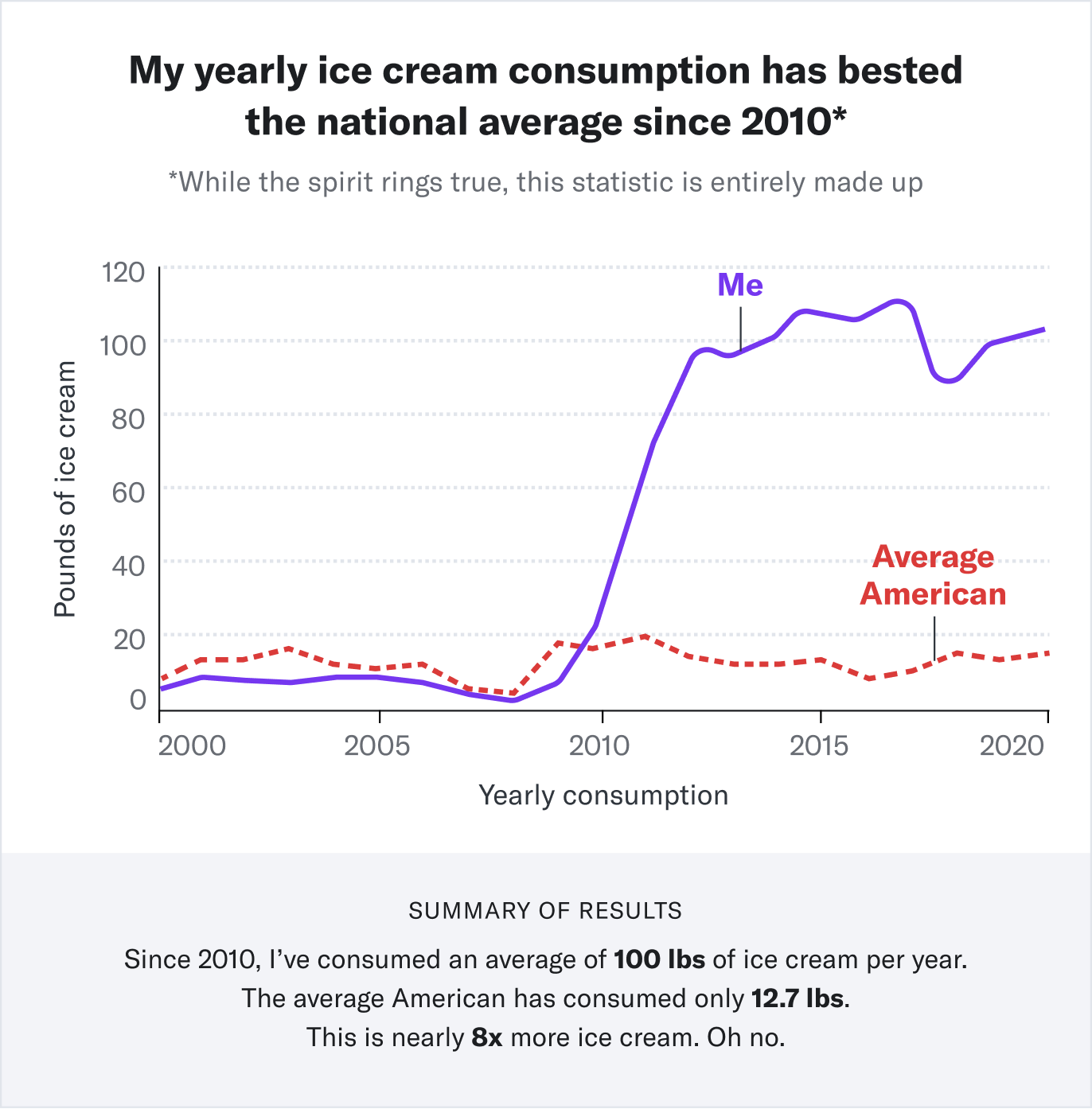
Anatomy Of An Accessible Graph
The example below is a graph that’s accessible in its own right—it doesn’t rely on a table to communicate the data to those using assistive technologies.
Let’s break down the design:
- Title: Give the visualization a descriptive “takeaway” title that illustrates the major insight.
- Fine: “My ice cream consumption compared to the national average”
- Great: “A graph titled: My yearly ice cream consumption has bested the national average since 2010. From the years 2000 to 2010, the yearly ice cream consumption levels of myself and the average American are similar. Around 2010, my consumption level spikes much higher and remains that way to the present day. The summary of the data is as follows…”
- Summary: In text, summarize in real, human words the story the information seeks to convey. This text can be discoverable only by assistive technology. If it’s also visible on screen without those tools, even better.
- Ask yourself: How would you describe the graph and its insights to a friend? Better yet, ask a friend to analyze it and summarize what they find.
- Axis labels (when applicable): Label each axis and their tick marks. This should be visible to the user and accessible through assistive technology.
- Data labels: Label each data point directly—use a connecting line, if you need to—rather than using a separate color-coded key. Users who cannot discern certain colors will still be able to interpret the data.
Take the following into account during implementation:
- Alt text: Ensure your visual has descriptive alt text.
- Bad: “ice_cream_consumption_chart”
- Great: “Graph showing my yearly ice cream consumption is much larger than the national average”
- SVG format: If you can go the extra mile, build the graph using SVG rather than a basic HTML image. It provides a better experience to those using screen readers, as it allows access to the individual elements inside the graph. Read more about SVG graphs.
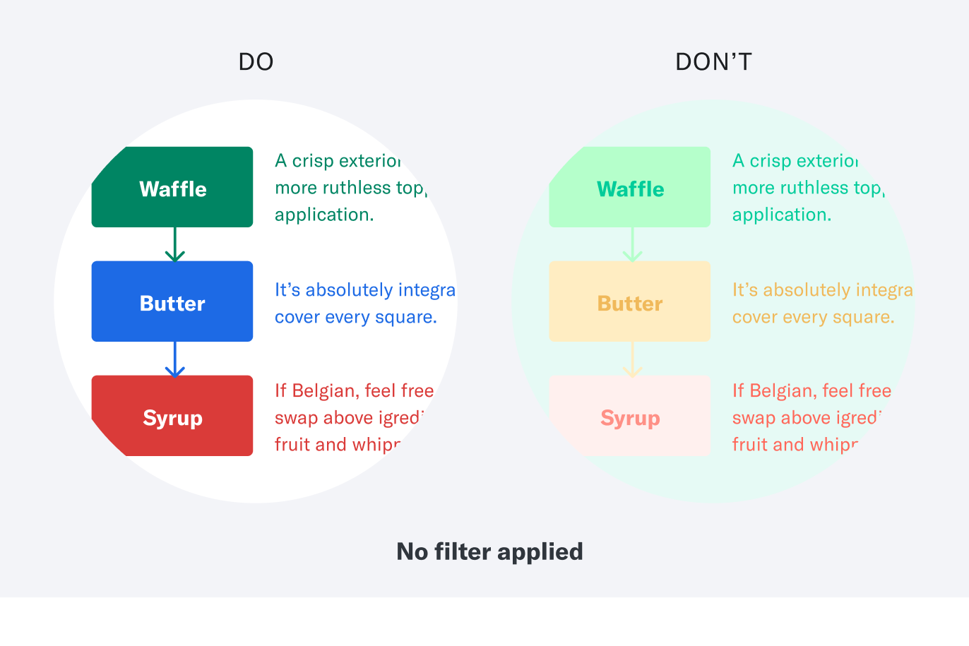
Visual Best Practices
Once all the right elements of your data visualization are in place, follow the guidelines below for its appearance. Here, we need to take into account both users with assistive technology and color vision deficiency.
To support colorblind users:
The following example images feature visual dos and don'ts. For the images in this section, I’ve duplicated them and applied a filter on the second version. The filter is meant to simulate how a person with colorblindness might perceive the original example.
Follow color contrast guidelines.
This might be a given, but it’s always worth repeating since it ensures legibility for all users. Here’s a deep dive into color contrast guidelines and how they work for more information.
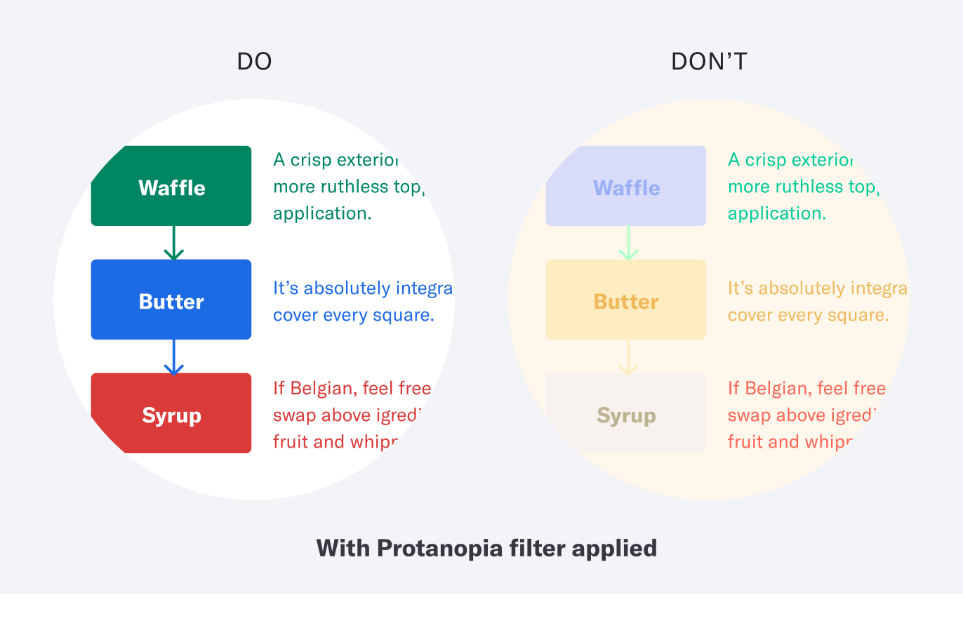
Below is the same example with a filter applied to simulate how a person with Protanopia would see it. The information in the “Don’t” version is even more difficult to make out.
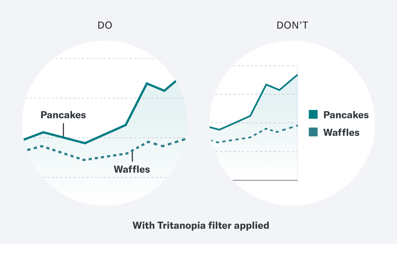
Label data points directly.
It’s quicker to read, and ensures the graph can be understood without reliance on color.
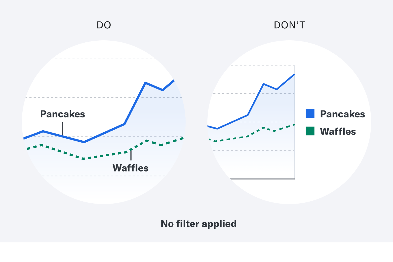
Below is the same example with a filter applied to simulate how a person with Tritanopia would see it. It’s nearly impossible to make sense of the color-relient key.
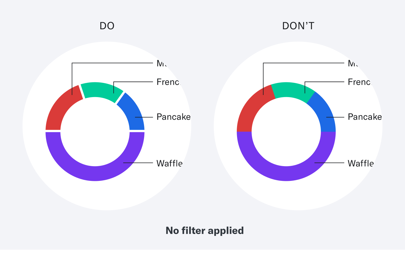
Separate elements with whitespace or pattern.
This means distinguishing between data isn’t entirely reliant on contrast between colors. Add whitespace between adjacent sections in a pie chart, or use different patterns in a line or bar graph.
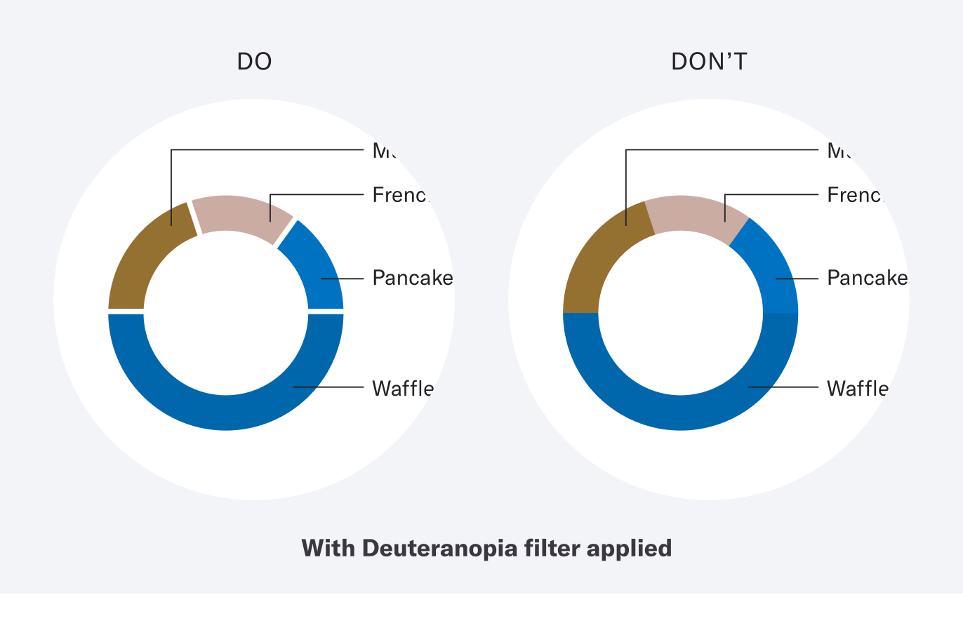
Below is the same example with a filter applied to simulate how a person with Deuteranopia would see it. Notice how the blue and purple sections nearly blend in the “Don’t” version.
To support assistive technology:
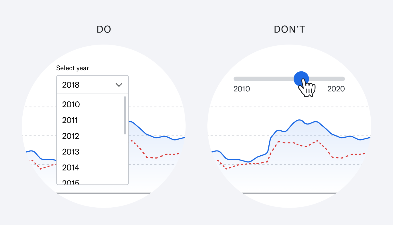
Avoid complex tooling.
Stay away from sliders or other intricate tools when allowing users to manipulate the graph. Instead, try dropdown inputs—they can be used by screen readers.
Avoid hover overlays.
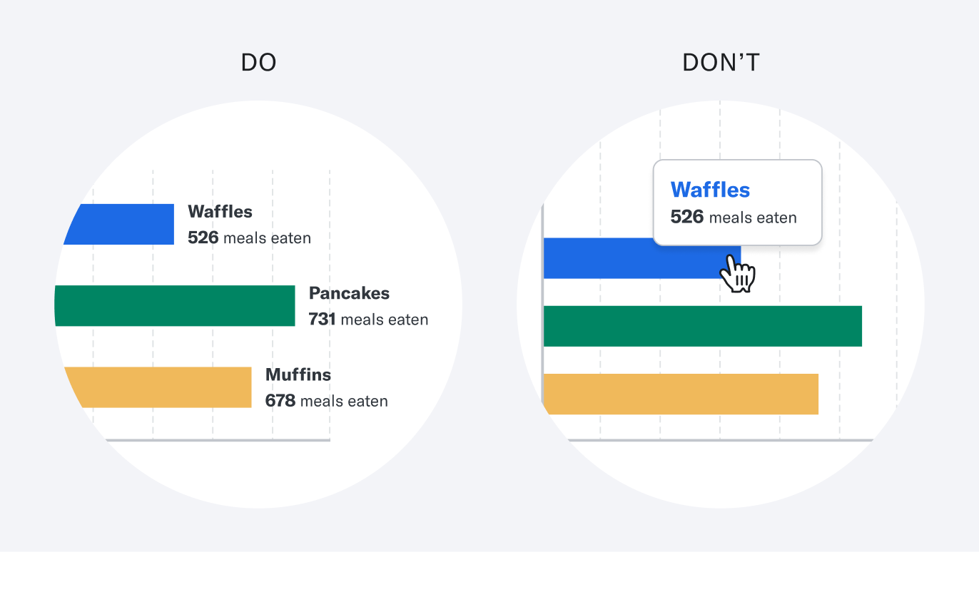
Don’t require a user to hover over a graph to see the data output. This is often difficult or impossible to do when using assistive technology. Instead, show the output at all times.
Remain curious.
It’s easy to write accessibility off as restricting creative license. In fact, these constraints are an incredible tool. When you design for accessibility, you’re not only assisting folks with disabilities, but embracing a vast range of life experiences. You serve the person recovering from a brain injury who has trouble concentrating. Or the parent juggling their newborn while managing their finances. Or someone at a sunny park, reading on their glare-filled phone screen. A clear and straightforward experience benefits everyone.
The learnings above are by no means an exhaustive framework for accessible data visualization, but I hope they are helpful. The conversation about digital accessibility has come far, but it also has a long way to go. As designers, we can use our curiosity and empathy for users to drive it even further.
Citations
1 World Wide Web Consortium (W3C), Introduction to Web Accessibility 2 National Eye Institute, Types of Color Blindness
Any links provided to other websites are offered as a matter of convenience and are not intended to imply that Betterment or its authors endorse, sponsor, promote, and/or are affiliated with the owners of or participants in those sites, or endorses any information contained on those sites, unless expressly stated otherwise.