Kim Pham
Meet our writer
Kim Pham
Former Brand Designer, Betterment
Kim is a former Brand Designer at Betterment. She previously worked at Two Sigma Investments and her former stomping grounds are in Raleigh, NC. In her spare time she can be found practicing illustration and thinking about her next meal.
Articles by Kim Pham
-
![]()
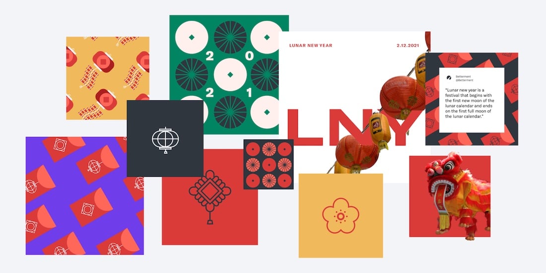
A Celebration of Culture Through Design
How Asians of Betterment highlighted Lunar New Year through stories from our community. ...
A Celebration of Culture Through Design How Asians of Betterment highlighted Lunar New Year through stories from our community. Hear more from Mai Nguyen, Cat Gonzalez, and Pam Do from Asians of Betterment and their collaboration with the Brand Team. Mai Nguyen and Cat Gonzalez, AoB Leadership Asians of Betterment (AoB) is an Employee Resource Strategy Group (ERSG) that was founded in early 2020 to serve the many Asian employees at Betterment. We saw an opportunity to build community over our shared backgrounds and experiences, especially as we transitioned to remote work. At the start of 2021, we wanted to highlight Lunar New Year, a huge event celebrated by many parts of the Asian community. A great way for us to celebrate Lunar New Year would be through sharing our family traditions and childhood memories. By spreading our stories both among ourselves and externally through an Instagram post, it helped our community feel seen and gave us an opportunity to share this joyous celebration with our colleagues. Hear more about how we landed on our final designs. Kim Pham, Brand Designer The idea of this post was to highlight stories within the AoB community and share how folks celebrated Lunar New Year as kids—most importantly, how we spent our red envelope money. The red envelope tradition is shared across many cultures and is generally gifted from the older to younger generation as a way to symbolize good luck and prosperity in the new year. The AoB team reached out to those within the group and received many responses, some that were recognized as traditional celebrations and some that were more unconventional. We thought it would be fun to illustrate some of the responses on the Instagram post. I took a look at Style Closet, Betterment’s design system, as a starting point for creating these illustrations. Our iconography style, which lives across our product and in marketing, has a simple utilitarian look that I used to inform early sketches. Even though I was directly translating Lunar New Year imagery and cultural motifs into our brand style, it still felt like the illustrations were missing what makes this holiday such a meaningful celebration. Lunar New Year celebrations have an inherent boldness, from the striking red color palette, to tons of firecrackers and strung-up decorations. I remember weaving through the streets of NYC Chinatown during Lunar New Year, leaving behind a trail of confetti and bumping into people of all backgrounds who were excited to share in our culture. I wanted to find a way to bring that joy and excitement into the visual, so I tried combining photography from Lunar New Year events. Although this helped capture more vibrant memories and emotions, we wanted to bring the designs closer to our brand style, and found a happy medium with these playful patterns. Lanterns, firecrackers, paper decorations, and Chinese coins were the inspiration for these illustrations. The added color and detail, typical of any red envelope design, helped give these visuals life and motion. We wove elements of these illustrations into the social post and shared a version of them as Zoom backgrounds for the company. Pam Do, AoB Leadership The power of design not only lies in capturing attention, but also in embracing identity, educating others, and creating bonds of allyship. In Kim’s Lunar New Year designs, the interplay of Asian tradition and Betterment’s design tenants highlighted the bold and joyous characteristics of Asian culture and identity, which invite communities of all cultures to join in celebration. We partnered with the Brand Team to post the Lunar New Year designs on Betterment’s Instagram page. Our Instagram was also used to celebrate Black History Month with fellow ERSG, Black at Betterment. Both Asians of Betterment and Black at Betterment were able to celebrate and advocate for our group’s history, struggles, resilience, and hope for a better future. Asians of Betterment is taking hold of the momentum from Lunar New Year and finding ways to bring our diverse identities together in celebration. Currently in the works: Asian Pacific American Heritage Month, coming to our social media this May. -
![]()
Behind the Scenes of Our Holiday Creative
How the Brand Creative Team set out to imagine togetherness and connection with our ...
Behind the Scenes of Our Holiday Creative How the Brand Creative Team set out to imagine togetherness and connection with our Betterment family Like most of 2020, our holidays might look a bit different. We spent much of this year finding creative ways to spend time with our loved ones and colleagues. This surfaced the idea of togetherness, despite us physically being apart. So, as creatives are wont to do, we thought about how we could bring this idea to life. Get a behind-the-scenes look into the design process of our new holiday illustration with Brand Designers Kim Pham and Matt Calabrese. 1. Start with a sketch Kim Pham: I began by illustrating rough concepts that Matt, our 3D modeler extraordinaire, would implement using Betterment’s visual style. For these illustrations, all I needed was my iPad, Apple Pencil, and Procreate app. A couple of add-ons that help me with drawing is this Artisul stand and this paper-like screen protector. Working in Procreate allows for endless iterations—a value we’re into here at Betterment—and includes an animation feature that can help with storyboarding ideas. I couldn't help but start with throwing a string of lights around our speedometer because, well, what’s more festive? Matt and I then talked about creating a sense of place and connecting that to the theme of togetherness. Since we have three office locations (Denver, Philly, and NYC) I thought it would be fun to illustrate a landmark of each within a snowglobe. But we realized there was something fundamentally missing from this scene: our customers. We wanted to create something that would represent the whole Betterment family. I started to think about the concept of home, and how we’ve all experienced home in a new way this past year, whether because we moved, were displaced, or we simply spent more time indoors. We agreed that a home, whatever that may look like to different people, represents more to us than in years past. Creating a little window into different worlds allowed us to feel a bit more connected. From there, we thought of ways we could simplify the visual and ended up merging a couple of the ideas. We used the snow globe as a foundation because, hello, festive, and the idea of a bubble resonates this year. To top it off we used one of our existing goal illustrations to really set this cozy winter scene. On the Brand Creative Team, there's no shortage of sharing. We love to share ideas early and often and to ask for feedback in our twice-weekly Creative Studio meetings for some face-to-face time. We also make great use of our team Slack channel to get thoughts on ideas. And that's where we got this gem from Senior Designer Michele: Our Floridian colleagues confirmed: Lightly falling snow can make even our warm-weather friends feel holiday delight. 2. Time to 3D Matt Calabrese: Thanks to Kim’s lovely sketches, I had a pretty clear vision for how this snow globe idea could come to life in 3D. I fired up Cinema 4D and got straight to work. What’s nice about the snow globe visual is that it’s composed of basic primitive forms, so it fits nicely within our design language for 3D illustrations. The snow globe itself is simply a cone, a cylinder, and a sphere stacked on top of each other. Then I removed the bottom part of the sphere to make it flat, and gave it some thickness since it would become the glass part of our snow globe. Then it was time to fill in the snow globe with our little winter scene. I had already created a 3D house, so I placed it in the center and started to build some more elements around it. Kim had some trees and a snowman in her sketch, so I felt it was important to add those in to create a sense of environment. And, of course, we can’t forget those twinkling lights! 3. Bring it to life Matt Calabrese: Once I finished composing the scene, it was time to bring our snowglobe to life. Of course our primary animation was going to be the snowflakes falling, so I didn’t want too much additional animation in the scene itself. Some smoke puffing out from the chimney and some light flickering in the window was enough to imply that not only is this little house occupied, but its inhabitants are nice and toasty. To animate the snowflakes, I used a dynamic simulation in Cinema 4D. Basically, the software does its best to simulate gravity, and to reflect how objects would bounce off of each other in the physical world. This kind of calculation can be pretty demanding on my computer’s processor. Luckily, all I had to do was place the snowflakes on the ground and give the snow globe a good shake—just like in real life! Last but not least, it was time to light, texture, and render our animation. This is probably my favorite part of the process because it really determines the look and feel of the final product. I lit the scene using a very basic studio light setup. Then, I applied our different brand materials to each of the objects to give them some color and texture. After trying out a few different looks, I was ready to smash that “render” button, and composite the animation for final delivery. Here’s a final look at the holiday animation—ain't it cozy? You can find it on our social media. Wishing you and yours joy, peace, and a renewed sense of togetherness this season.